
EMPIRICAL CAPITAL. Brand Identity Design
BACKGROUND
Based in Nashville, Tennessee, Empirical Capital is a private hedge-fund that delivers high-quality returns for its investors.
After twenty years of successful growth, the founders were persuaded to update to a more contemporary brand identity. Wanting to stay relevant, the firm followed another designer’s advice and executed a quick pivot. Unfortunately, that update was poorly executed and not positively received.
Empirical Capital hired Thrasher Design Studio to remedy its visual identity crisis and clarify its brand identity.

Our initial brand audit revealed the company was using both the original and newer brand identities—a confused message—that more problematically, suggested the existence of two separate companies.


Images from our brand audit (above): the mixed-message of Empirical’s former branding
Such inconsistency can have troubling implications for a firm overseeing a multi-billion dollar fund: disorganization, lack of attention to detail, or worse, the potential failure to assure clients of a secure financial future.
Your customers develop expectations based on past performance. To familiarize ourselves with your legacy, we look at your existing brand identity and its expressions over your history, to maintain context for future success.
The firm’s founding brand identity—Empirical Capital with lines, dots, and an integrated torch with flame comprising the letter “E” atop—was decently executed, alluding power and strength. But many of its design embellishments seemed unnecessary and complicated an already outdated look.
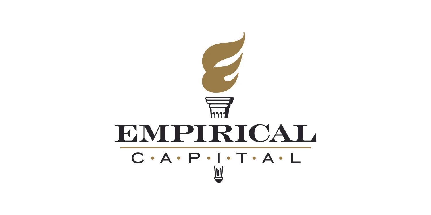
Logo from Empirical Capital’s original founding brand identity.

The previous designer’s unsuccessful “more contemporary” logo update.
Empirical Capital’s original logo design (above, left). The previous designer’s logo update (above, right).
Completely disconnected from Empirical Capital’s original logo, the earlier update’s “contemporary logo” was disappointingly generic, and failed to conjure the high-quality returns the company’s investors receive. The softer, flimsy shape of the rings in the “E” seemed weak in combination with the thin sans-serif typography. And with the original black and gold brand colors replaced with lighter, cool blue tones, nothing remained of the original’s association with strength or financial prosperity.
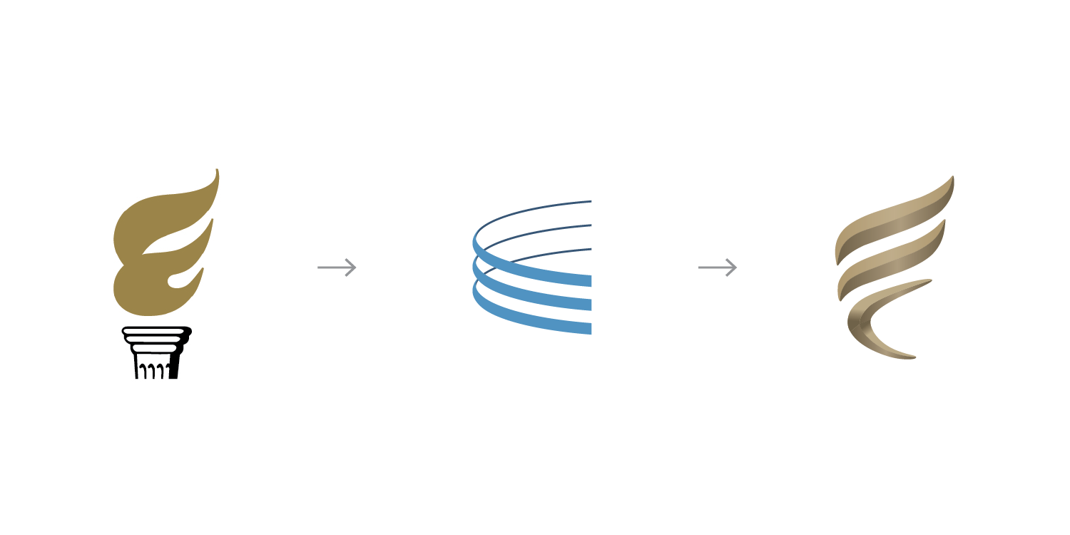
The evolution of brand: from the original logo symbol (left) to the unsuccessful contemporary logo update (center) and our design (right) Empirical Capital’s final logo symbol.
SOLUTION
We felt it was important to maintain brand consistency with a strong, modern identity that expressed prosperity and growth—but that also indicated an ability to withstand shifting market trends. As a continuation of Empirical’s long-standing client relationships, we built on top of its existing brand foundation to suggest consistency, longevity and ongoing trustworthiness.


WHAT IS OLD IS NEW AGAIN
Why completely replace something that works? Our new logo symbolizes the inheritance of the second generation carrying the torch forward, continuing the firm’s positive performance.
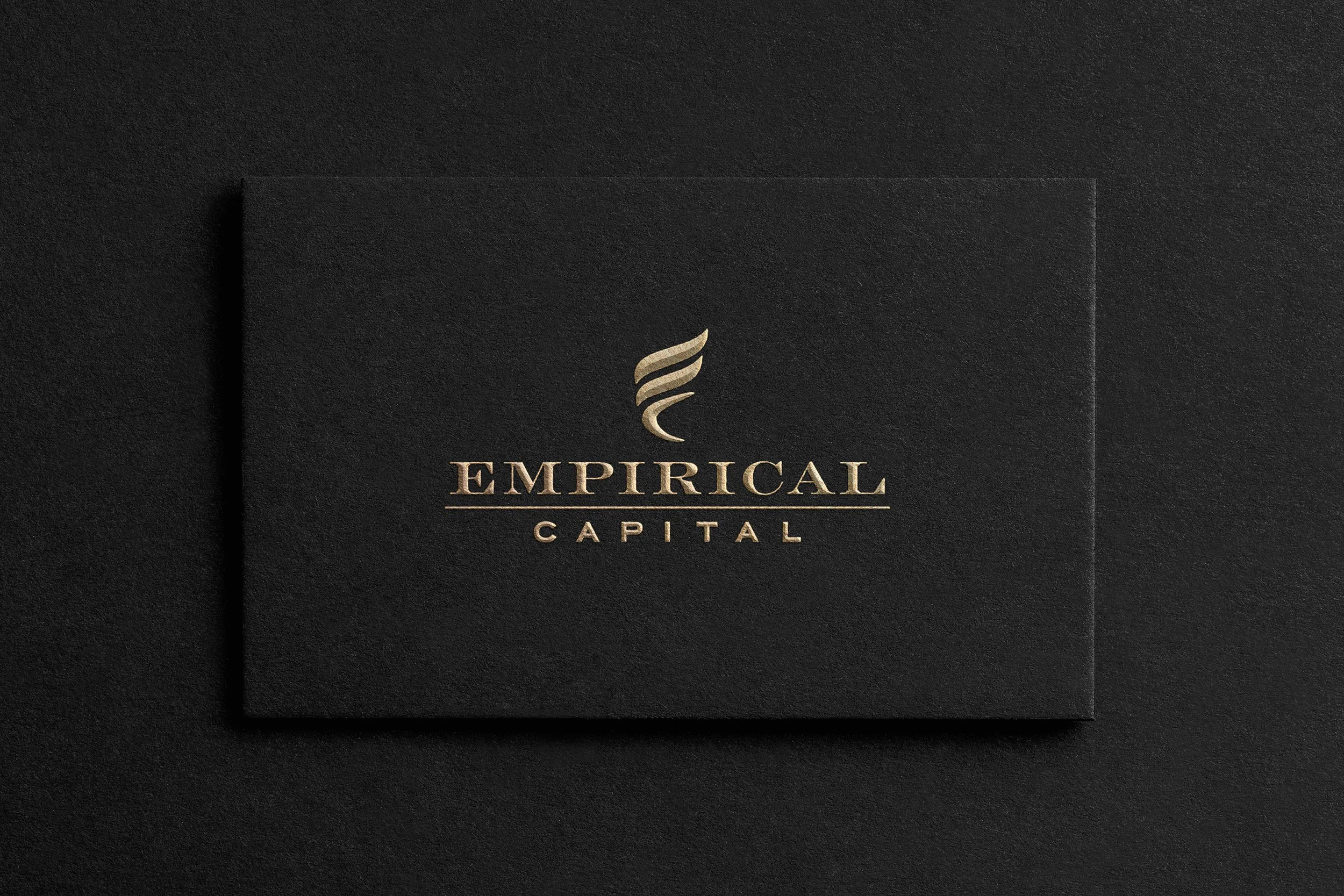
After successfully completing the brand identity overhaul, we executed new stationery collateral and an announcement card presenting the new identity to the fund’s customers.
The work showcases what we do best—sophisticated, refined and impeccably executed design—establishing a firm foundation for future growth while honoring the success of the past.

NEXT: See our luxurious interior design and custom signage update for Empirical Capital’s corporate office.